HBO Code Labs
(Jan - Mar 2016)
Over the winter of 2016, I worked as a UX designer at HBO, Seattle on the Digital Products team.
I worked on concept explorations for designing the history feature for HBO's streaming services HBO GO and HBO NOW. Since these HBO products span cross-platform from mobile, tablet, desktop to connected TV, I faced an interesting UX challenge to design for different screen sizes, viewing distance and affordances.
History Feature Design Project
Problem Statement
When I came onboard, HBO's streaming services did not have a way for users to see the history of everything they had watched. I was given the task to explore how to present users’ watching history and to come up with explorations.
Investigation
Competitive Analysis
I started off by looking at how other digital streaming services (Netflix, Hulu, Showtime, Crackle) are showing history.
What's working
Content is directly playable
All of them have delete
Can go as far back as a user wants
What's not working
History is hard to find
None of them allow search
Longer history, lesser find-ability
No way to filter the content
Understanding why users wanted this feature
Remind me, what did I see?
What was the movie called that I watched 2 weeks ago?
When was this viewed? All of it, or just part of it?
I need to pick up where I left off
What was I watching? (when I got interrupted)
I want to track shows I’m following
Where am I in the series?
Understanding how users were watching HBO

What do the users care about?
What should they watch next?
What did they last watch?
Did they miss any episode?
Are there any new unwatched episodes?
Ideation
Problem with what was currently there in HBO
History is not shown to the users - they have to remember or recall what they have watched previously
Continue watching doesn't tell the user where they are in a series
“Completion-ist” users have a hard time to know if they have finished the series or are there any missed episodes
Two concepts
History as a list of everything users have watched in the past
Improving the continue watching experience
Brainstorming - Sketching
Having a bar that indicates which episodes have the user watch and which ones they haven't.
Giving users the ability to mark episodes as watched if they happen to watch it elsewhere.
The bar can have markers to show each users position in the series when HBO will have profiles.
Use tags to let users explore history. On searching they would get visualizations based on their query.
Module style design with the completion bar and direct CTA to play the next episode.
Timeline style design. Every month can have a title based on what the user watched most that month.
Using visualizations and giving users the data and the power to see patterns in their watching behavior.
Bar style design for completion-ist type users for showing movies by genre for completing.
Design Session Feedback
✅Easy way to see where the user is in a series
✅The ability to mark episodes as watched
While an intelligent search and showing visualizations were interesting, they were more inclined to users who want to explore. Whereas, history as a destination is primarily used for quick recall and remembering what did the user watch and when.
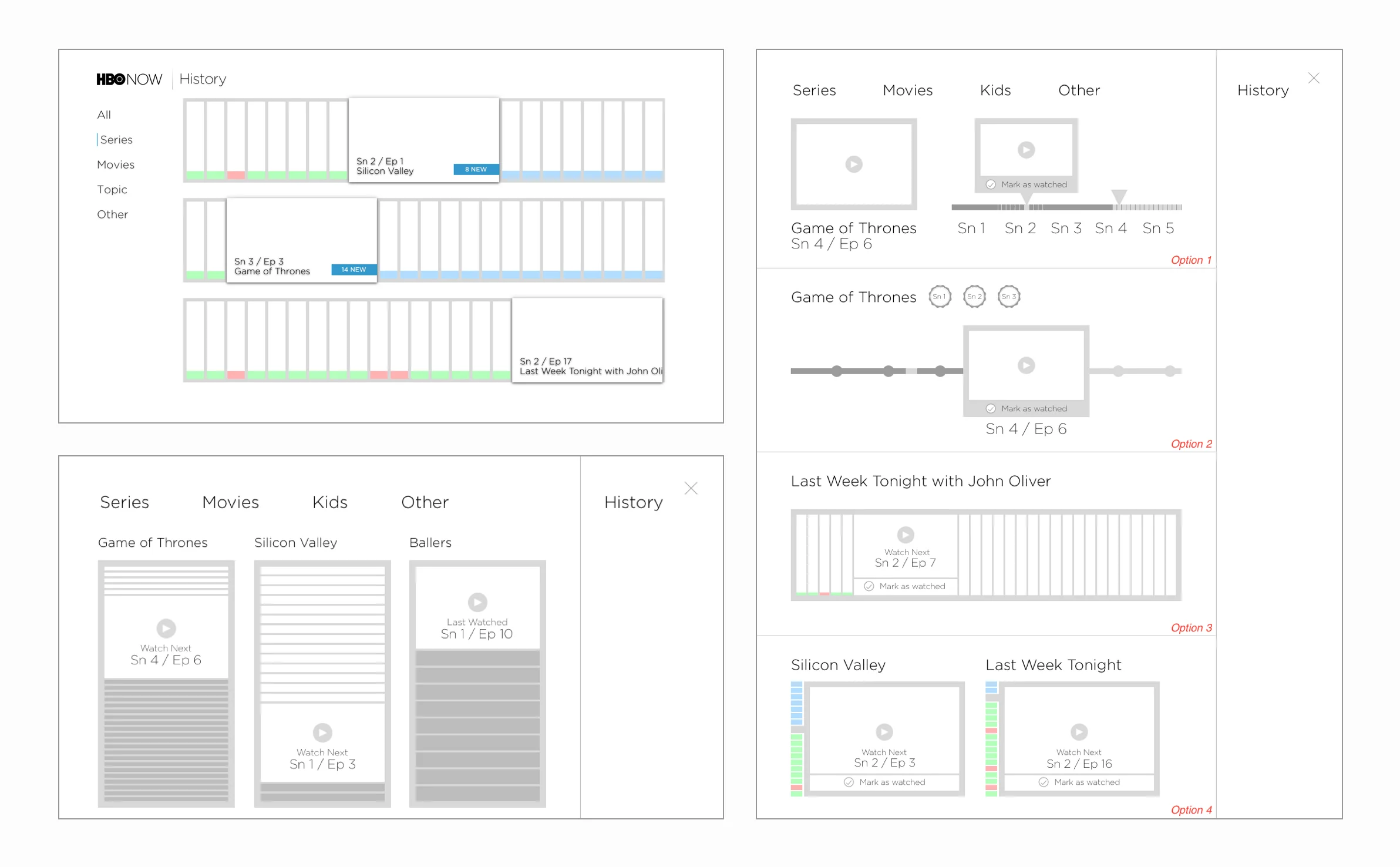
Wireframing
User Feedback
After looking at the wires, we brainstormed as a team to better understand how users would use this feature and where would this live in the HBO ecosystem.
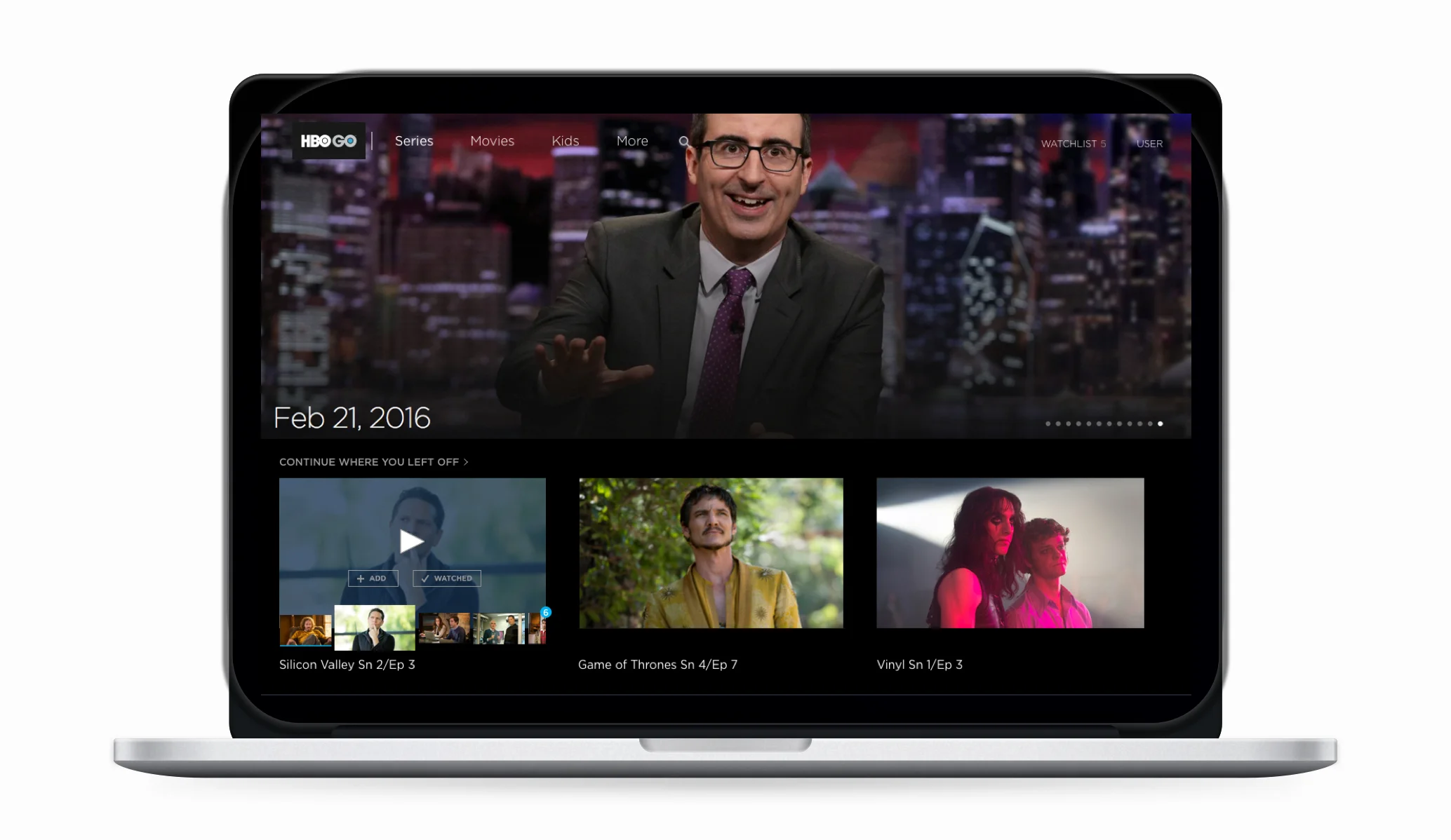
HBO already has a "Continue Watching" section. It shows the assets that have not been watched entirely and are in progress. Technically, a user's motivation to use the timeline, bar-style view is to continue watching from where they left off. Since, these two ideas were overlapping a lot, we decided to move this out of history and think of it as a concept that could live in continue watching. This could be showcased on the homepage to give users' an easier access.
Prototyping
First Iteration
1️⃣Shows what episode you should watch next
2️⃣On hover, it gives an indication of where you are in the series by showing a strip of all episodes on the side
3️⃣Gives users the option to watch episodes as “Watched”, if they have seen it say on linear
4️⃣Checkmarks tell the users which episodes have they watched
This design shows users what they should watch next right at the homepage. On hover, it shows where they are in the series. They can scroll through the strip of episodes on the side to look at any episodes they might have missed or to see how many new unwatched episodes are left.
One concern with this design was that the episode tiles on the side strip were too small to make out what was happening. Also there was no clear indication as to how many new episodes where there unless the user scrolls the side strip.
Second iteration
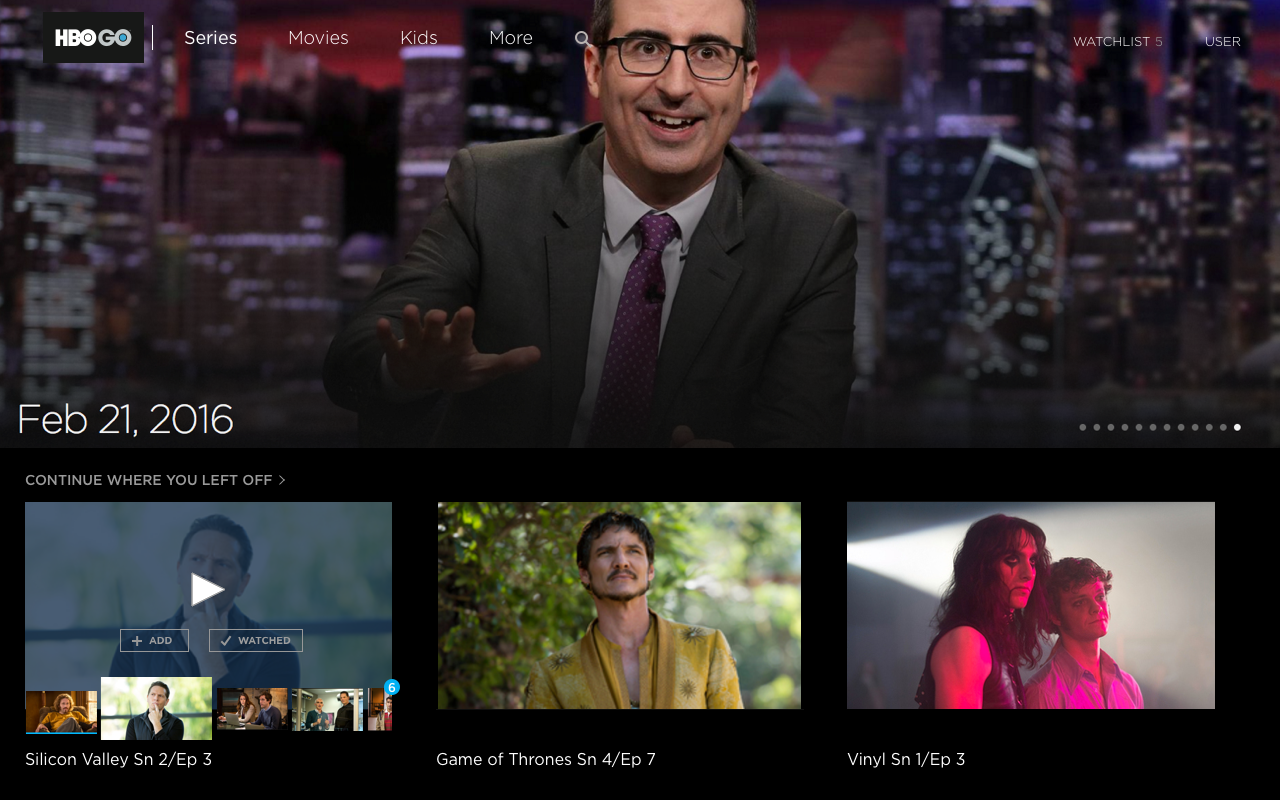
This design gave users a clear indication of how many new unwatched episodes were there by showing the numeric indicator at the end. The episode artwork is also bigger to showcase the content better.
Future Recommendations
Achievements for users: Badges on the series landing for completed seasons
Sharing: Social media sharing integration for completed series, badges, achievements
Coming up: For shows that the user has seen all the episodes, show the preview of the next one with its air date
Final Presentation
I got a chance to present my work in the weekly design crit to the whole HBO Design Team in Seattle and New York. The team appreciated my work and gave great feedback. History is not on HBO's roadmap right away, but they will use the research and design I have done when they plan to implement it for their streaming services.
What my mentor said after the internship concluded:
"We could not have chosen a better UX designer to kick off our intern program than Karan. When I managed him this spring it was clear he had the skills and quiet confidence to start contributing in his first week. As a result we asked him to review the intern project we initially spec’ed and make any adjustments to improve it. By shifting the focus somewhat he was able to make the project simultaneously more relevant to HBO and more meaningful to himself. He scoped and scheduled the project, then executed on it over the course of the program with very intentional process and design rigor. The design solutions he presented to the team on his last day elicited rounds of applause and positive feedback.
Karan is insightful, self-directed, and took feedback well. He is also very positive and curious. I deliberately looked for an HCI Designer with a strong drive for continued self-improvement for this position, and I feel we struck gold with Karan. He will be an asset to any team he joins and I hope to work with him again sometime down the road." - Drew Robertson, Sr. Designer, HBO
Reflection
I wish I could speak to more users and observe how they were using HBO to watch TV to get more insight into the actual problem to be solved
The project was conceptual, but if it was to be built I would’ve loved to A/B test some of these concepts and see how users use it