HTC
(Jan 2015 - Mar 2015)
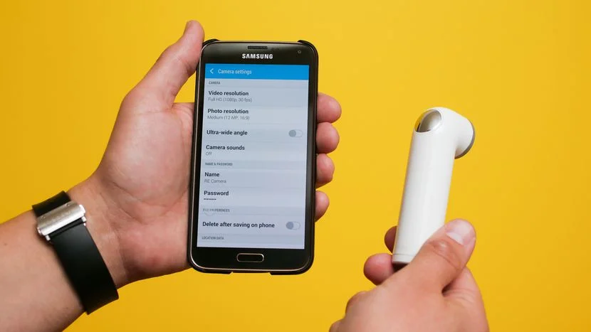
While at school, I got to work with HTC to conducted Usability Tests for the HTC RE Camera - a handheld, waterproof, screen-less camera that sends photos and videos directly to your mobile device via the RE Camera APP.
HTC RE Camera Usability Project
Team
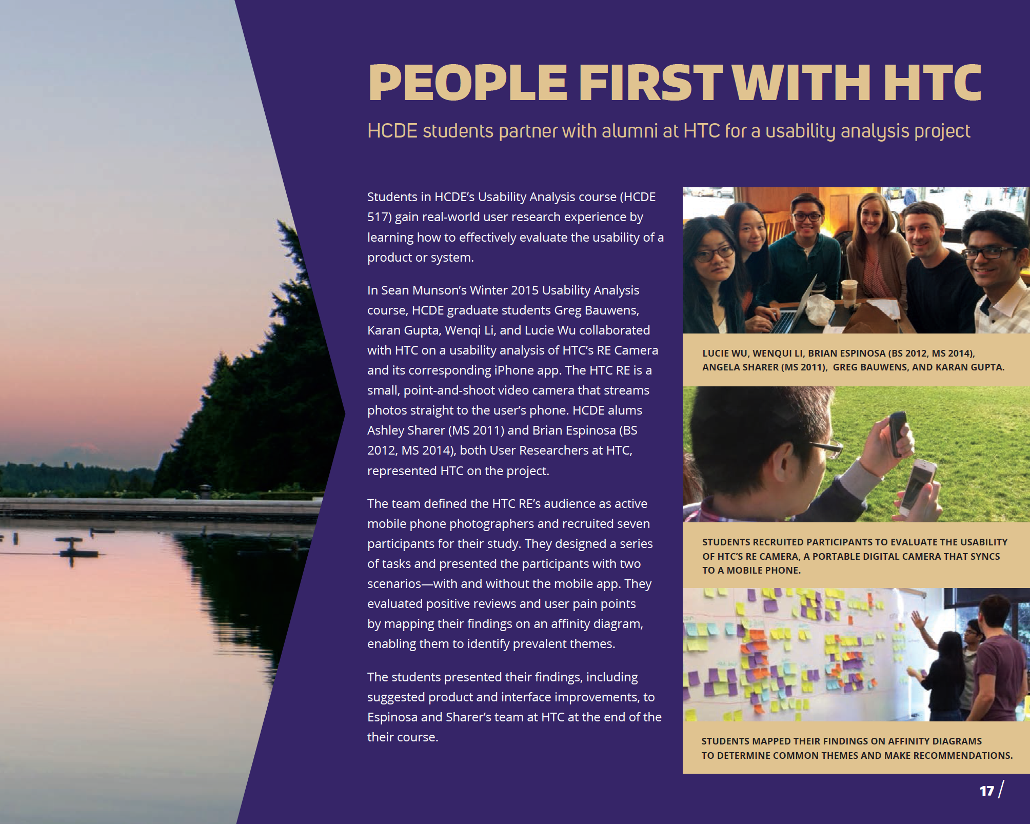
Gregory Bauwens
Karan Gupta
Lucie Wu
Wenqi Li
My Role
UX Research - Test moderator and Note taker
Problem Statement
Our client’s goal was to improve the usability of the camera and the RE app and see how parents who have kids in the age range of 3-10 year olds use RE to capture their young ones.
Investigation and Ideation
Creating an Interaction Map
To understand the camera and the app, we first laid out an interaction map to get familiar with its functionality and to be able to explain it to anyone.
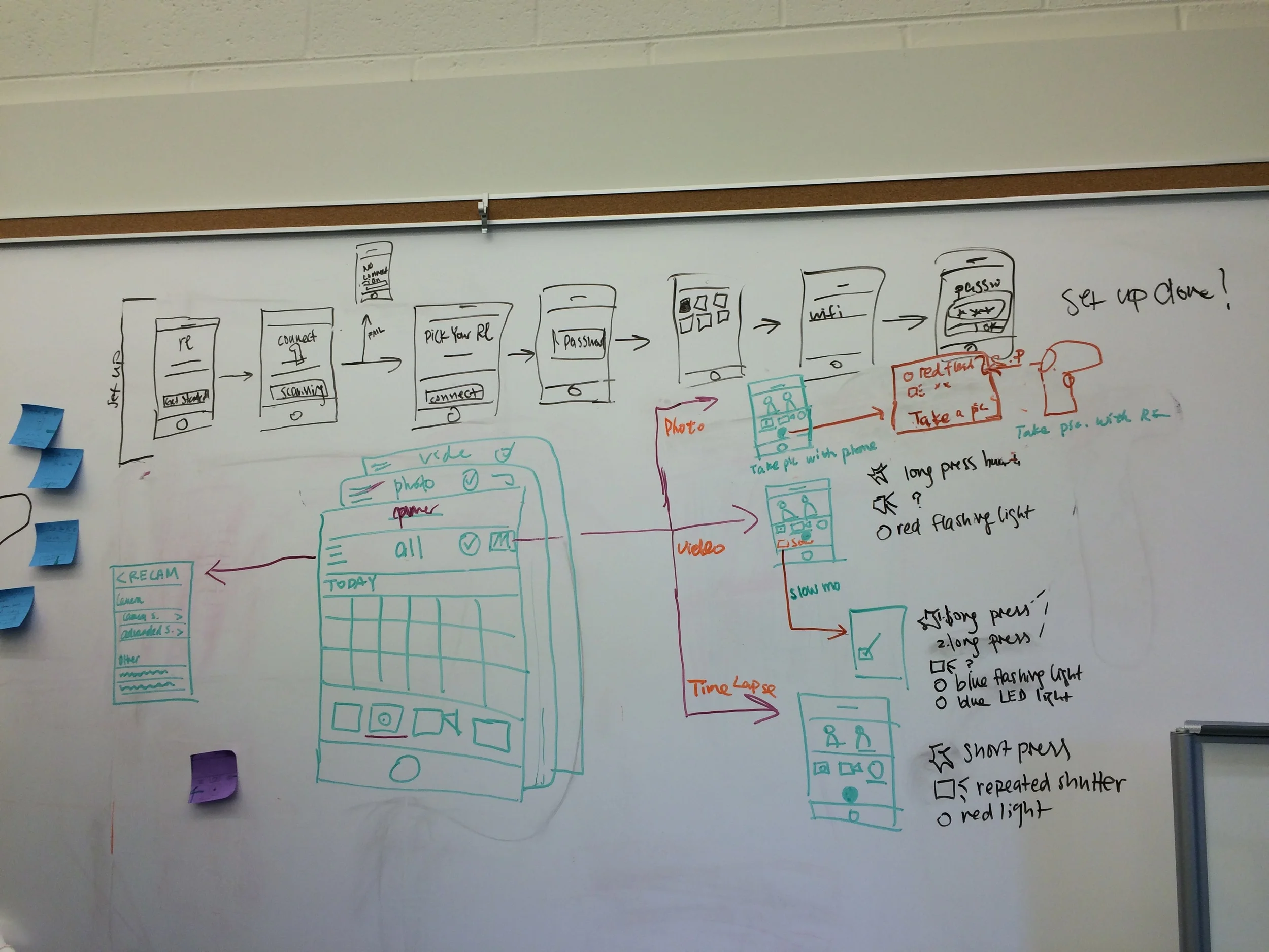
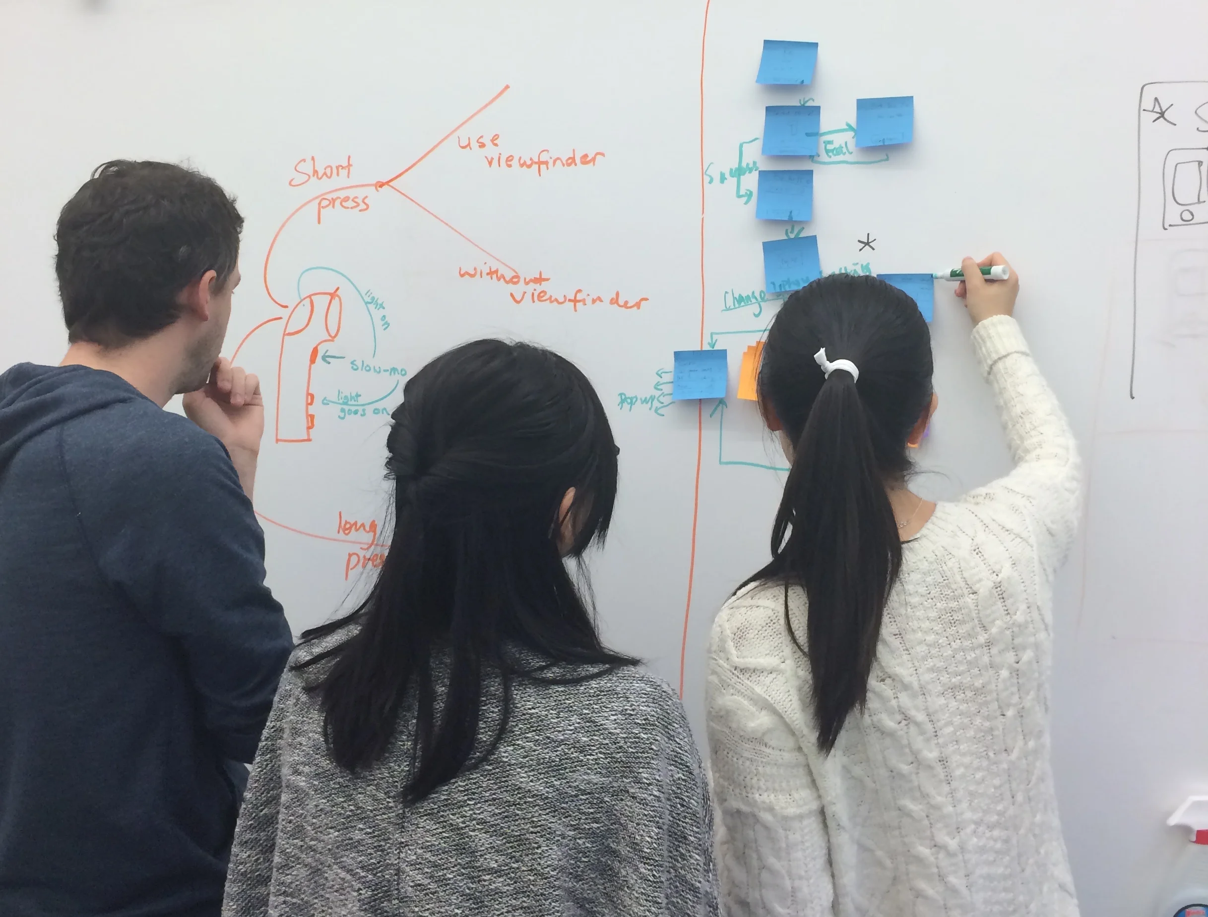
The map design was an iterative process. We started by brainstorming and laying out the screens on a whiteboard. This gave us an idea of the Information Architecture and the workflow of the app and the hardware.
The challenge here was to show the functions of the camera and the app integrated together. We sketched out an iteration on Photoshop and got feedback from some of our friends to see if they were able to understand how to navigate through the map. Based on their feedback we made some changes to come up with the final iteration.
Creating a Usability Plan
Coming up with specific research questions
Defining participant profiles
Enlisting the methods needed
Creating tasks and scenarios
Looking into what data will be collected
Planning how to evaluate and report the data
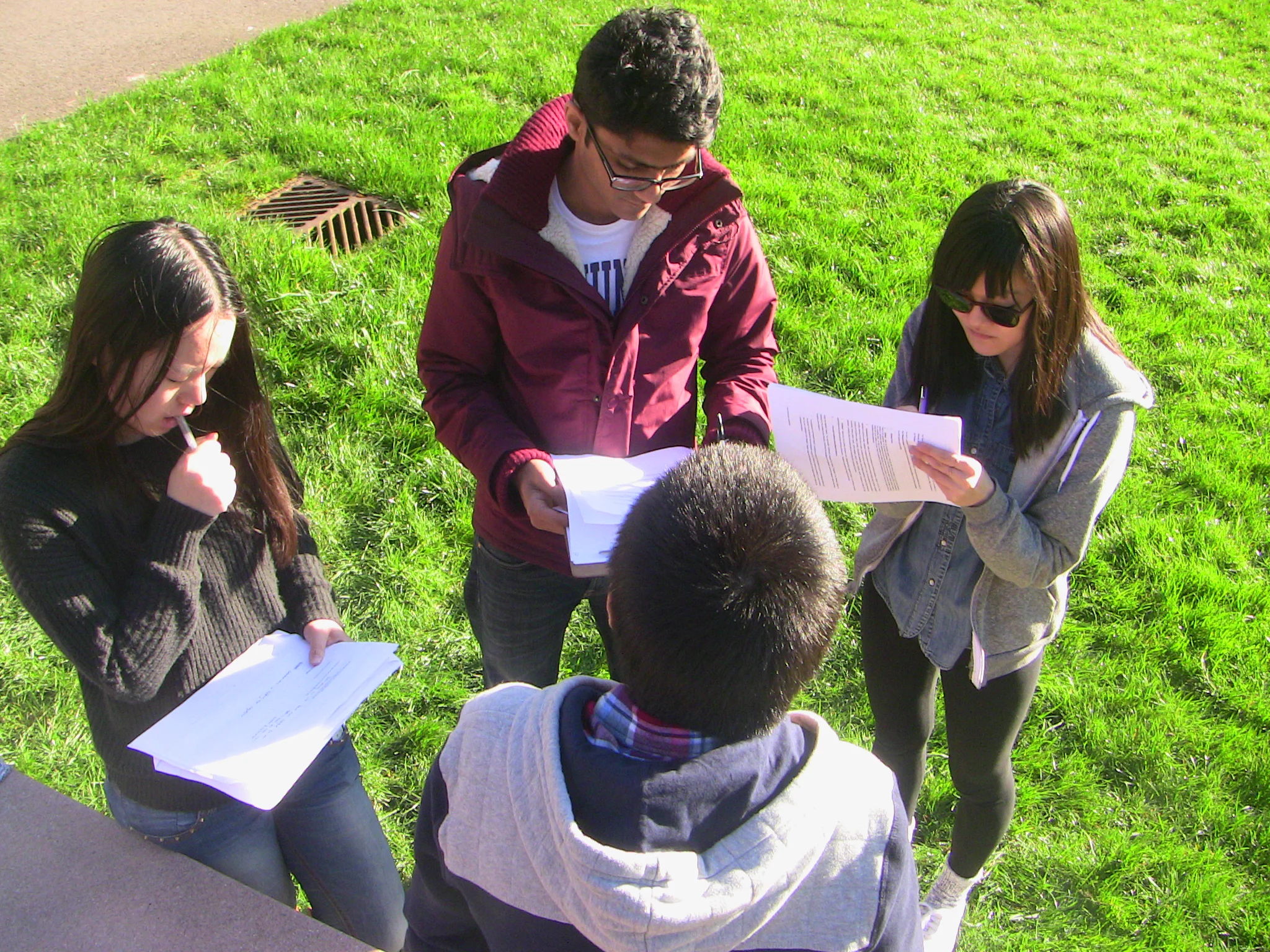
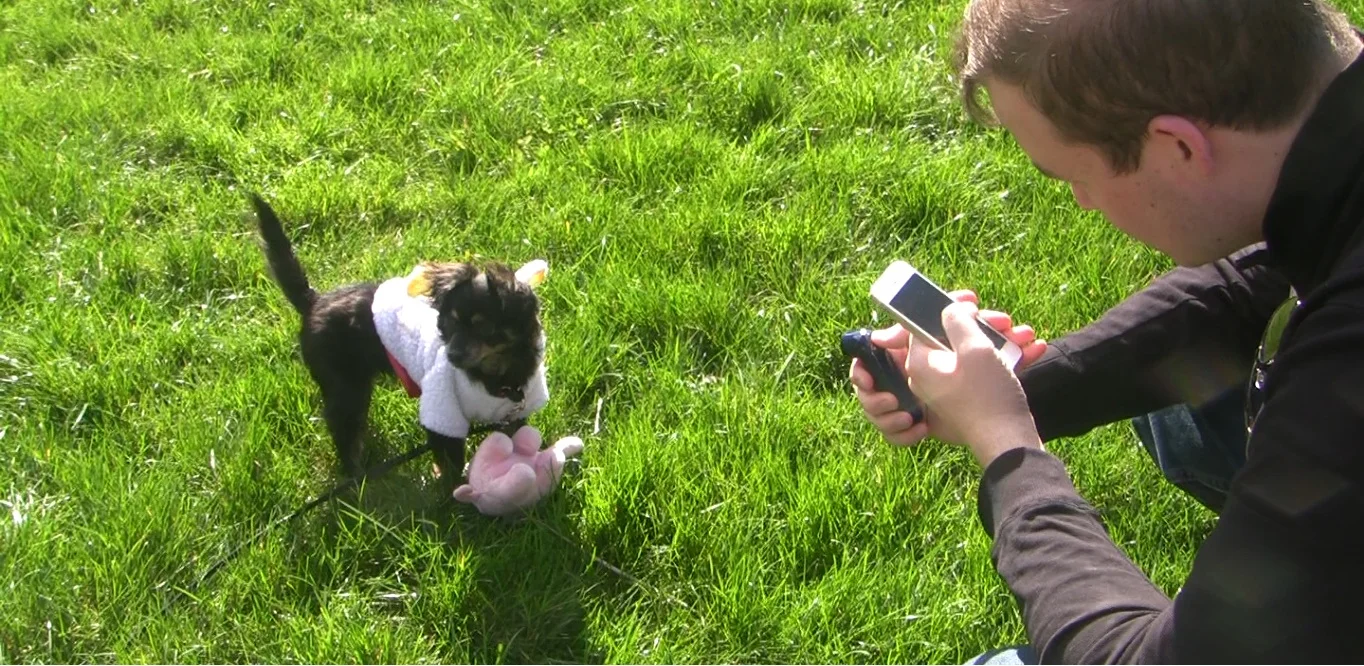
We planned to conduct our studies out in parks rather than in usability labs to replicate real-life settings where RE users would actually be using the camera. To make our participants active, we had our team's dog Sherman be a part of the usability tests, so that they can play around with the dog and have something real and moving to capture.
Here is the link to our study plan document: Study Plan
Getting the Usability Kit together
We put together all the material needed for our tests - Screening Questionnaires, NDAs for our participants to sign, Note Taking sheets, Moderator Scripts and SUS Scale forms.
We started out by sending the screener to network. Unfortunately, we did not manage to get any parents to sign up for our study.
At this point, we thought of changing our target participant group but not digressing from our client's main goal. Since our client was interested in seeing how people capture moving life, we decided to reframe the screener and recruit participants who are active users who own pets or are dog lovers so that we could still come up with the same scenarios. We got 15 responses out of which 6 had matched our criteria. So we went ahead and started conducting these tests.
Conducting the tests
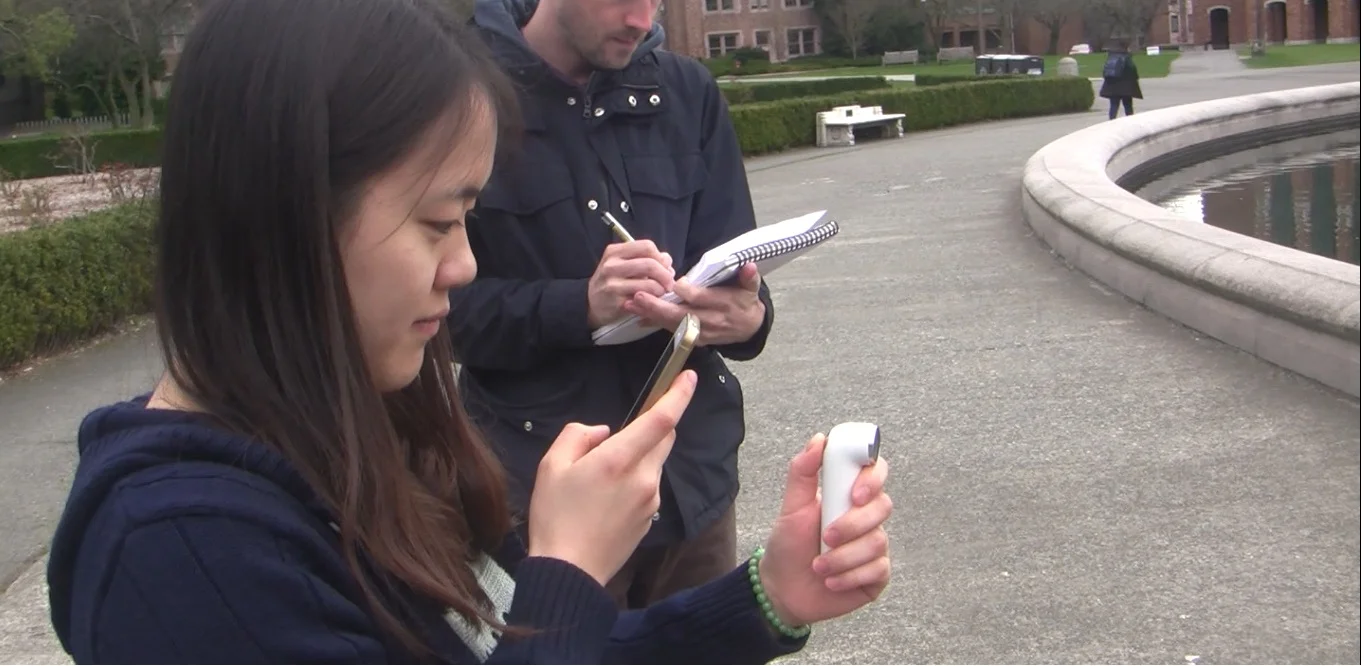
We first conducted a pilot test with a participant to do a formal run-through of the procedure. Based on this we made some tweaks to some questions and timed our study to make sure that we weren't exceeding our allocated times. Thereafter, we conducted 6 usability test sessions of approximately one-hour each.
All of us on the team shifted roles from moderator to note taker to video recorder to get a flavor of all these roles and get hands-on experience on how to conduct each one of these.
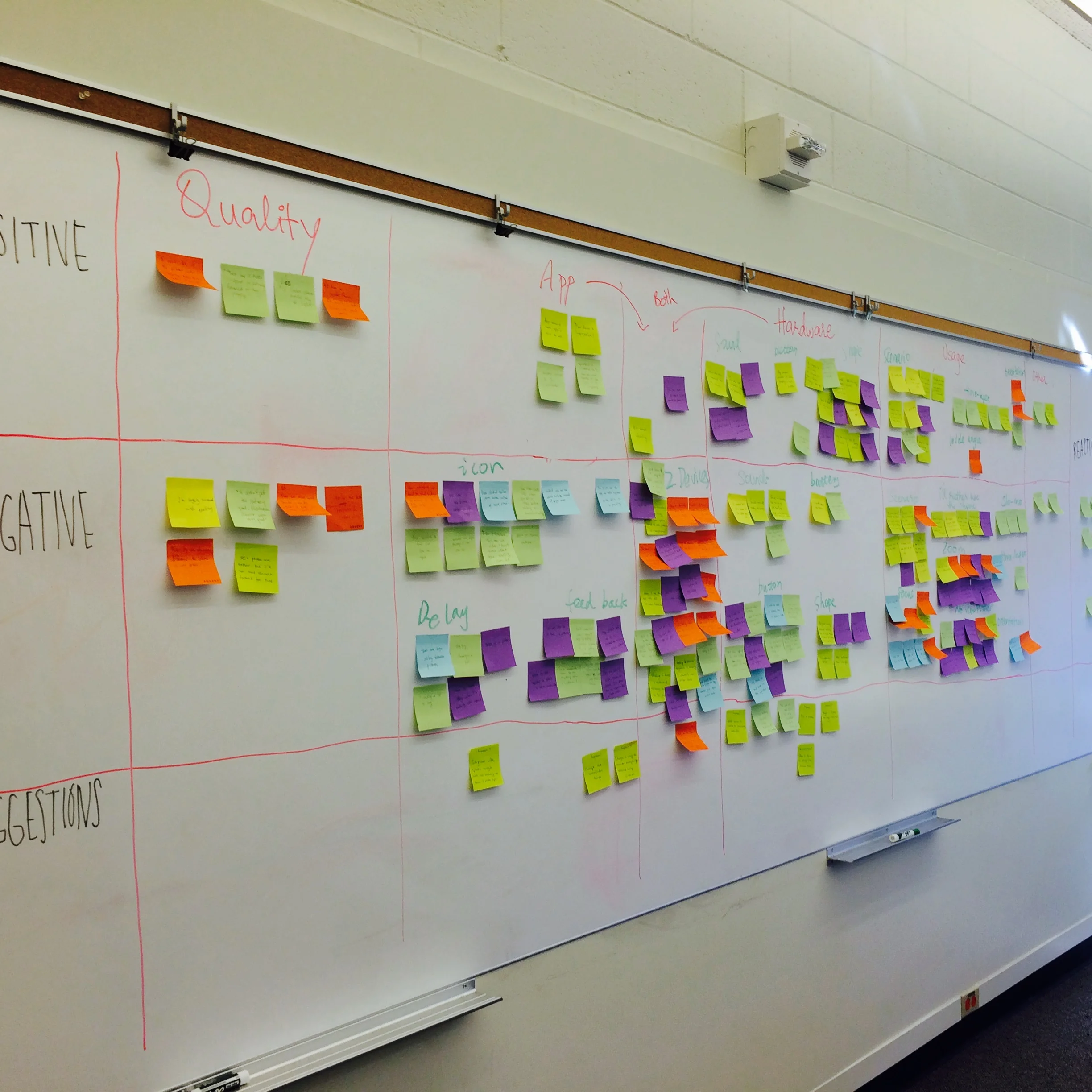
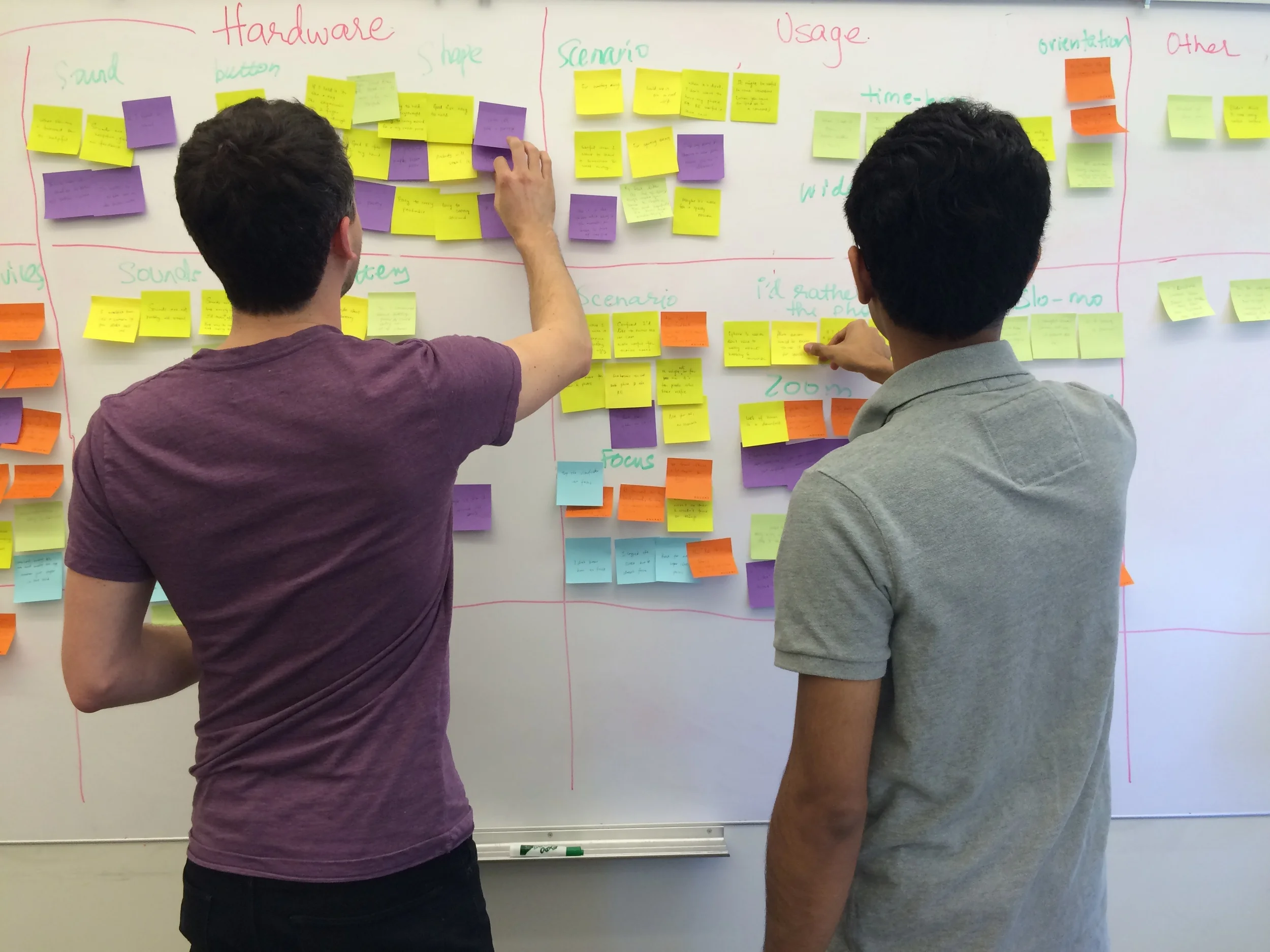
Findings
To consolidate our findings we started out by writing all of the user quotations and actions on post-its and doing affinity diagramming. We made clusters based on whether the comment was positive, negative or a suggestion.
Since the findings are pretty long and detailed, I am only touching upon some of the major ones here. If you are interested in learning more then I would be happy to share our final report with you.
Positive Findings
RE is good size and easy to hold
It looks cool and is unobtrusive
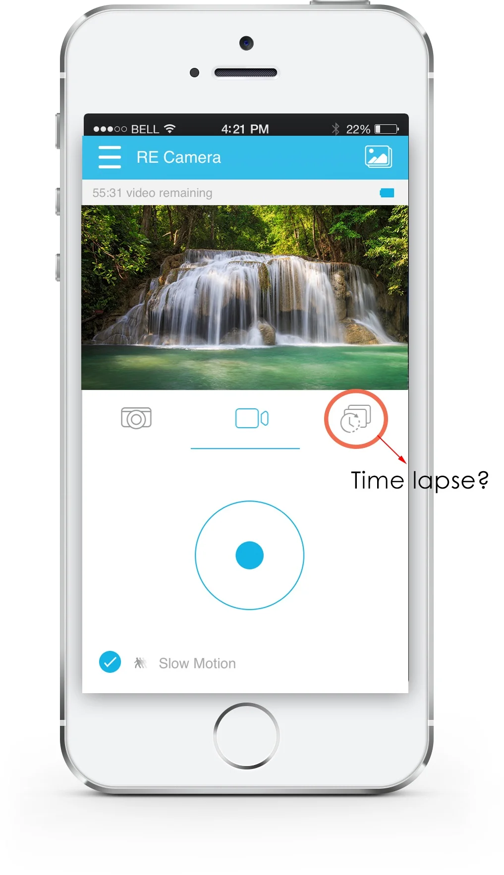
Time lapse is a good feature
Opportunities for improvement
Icons in the app are not intuitive
There is delay and lag when taking pictures and videos
Battery doesn't last that long
Users find it uncomfortable using RE without the viewfinder
It's not possible to view the pictures if the RE is out of range
Based on our findings we did severity ranking for each problem along with it's scope and complexity.
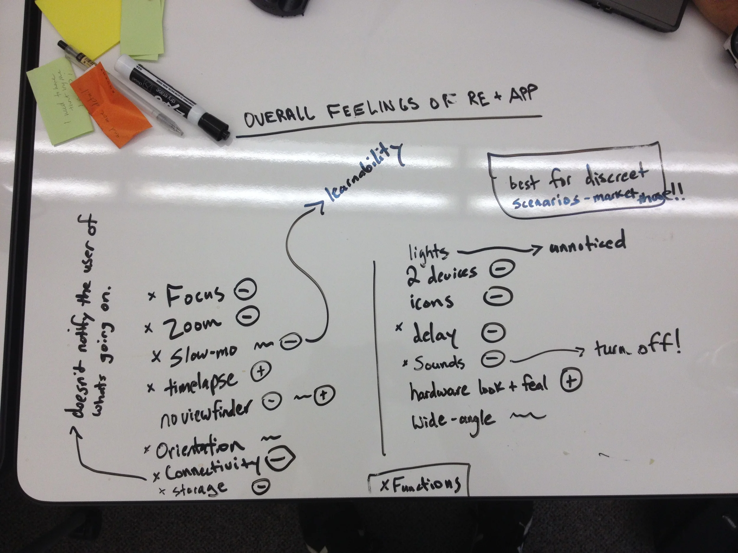
Suggestions
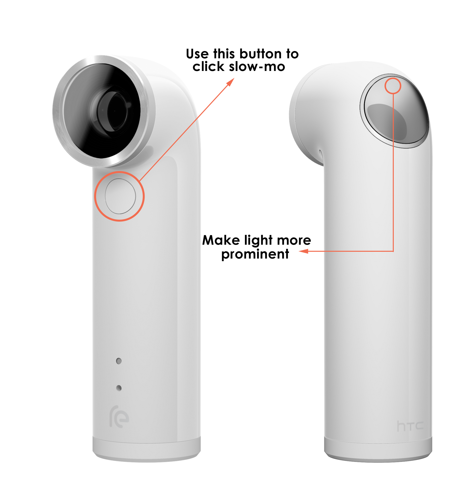
Our users had trouble finding whether they had started a photo or a video. Since our tests were conducted in bright sunlight, the light feedback on the RE was not visible. Our suggestion is to make it more prominent. Also, the button on the front was confusing to some of the users since it was used the put the slow-motion mode on/off and the user didn't know in what state the button was unless the checked their phone. So, instead this button could be used to actually click a slow-mo video rather than acting as an on/off switch.
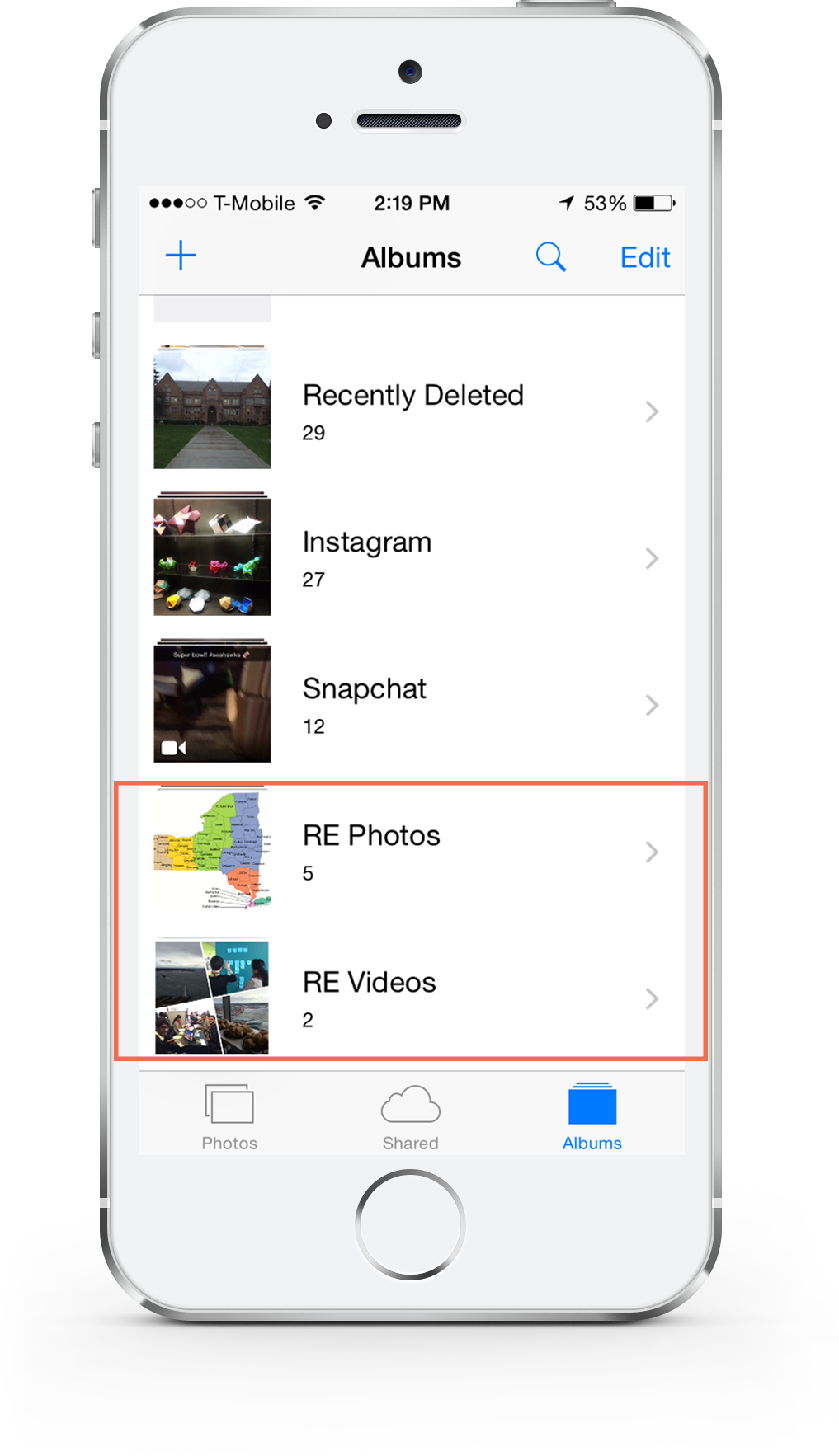
A lot of our users had trouble finding the photos once the RE was out of range and were annoyed by the fact that the photos could be viewed only if the phone was connected to the RE. First suggestion was to store the Photo and Video library locally in the phone.
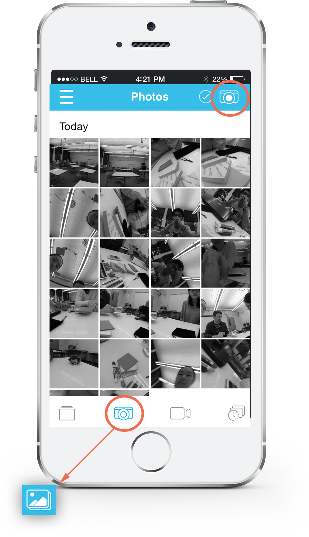
The icon used for clicking pictures and viewing pictures was used the same. Our suggestion was to use the gallery icon in place of the camera icon where the app shows pictures to make it more intuitive to the users.
The time lapse icon was not clear to 3 of our users and was even mistaken to be a self-timer by 1. We think that some more thought should be given to designing these icons so that they are more intuitive. One way is to use the native iOS standards of slow-mo and time lapse.
Presentation
Our team went to the HTC office in Downtown Seattle to give a 15 minute presentation discussing the key findings and talking about the suggestions, followed by a round of Q&A. We had the Visual Designer, UX Designer, UX Research Lead, Sound Engineer and the Development Engineer present. They found our findings useful and valuable and got them thinking about incorporating some of these to the next version of the product.
Here is the link to our final presentation: HTC RE project deck
Here is the link to our final report: HTC RE project report