Dropbox
(Oct 2017 - Now)
Part of the Growth team at Dropbox. Working on different parts of the customer journey from discovery and activation to expansion.
Project Team Join Experience
Team Structure
Team:
PM
Product Designer (Me!)
Copywriter
Engineer
Product Analyst
Duration:
4 weeks
Context
Dropbox offers two kinds of plans: Dropbox Personal (For Individuals) and Dropbox Business (For teams).
When people buy Dropbox Business, they pay for a certain number of licenses. For every license, they send invitations to these users on their work e-mail.
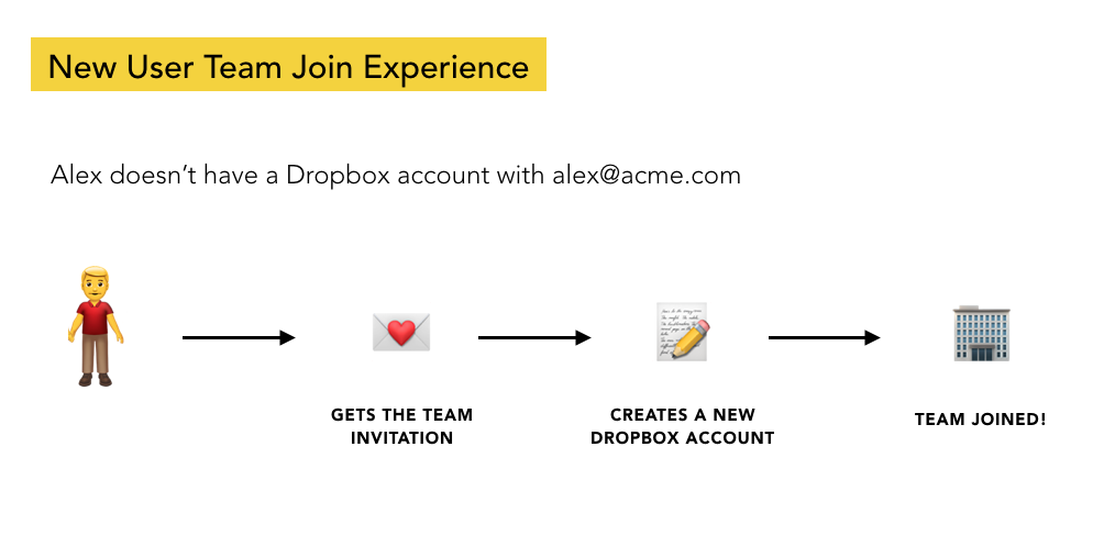
The receivers of these invitations could be users who haven’t previously created Dropbox accounts with their work e-mail or users who already were using Dropbox and had an individual account with the work e-mail.
Problem
While 85% of new users who are invited to Dropbox Business successfully join the team, only 65% of existing users end up joining 😔
Project Goal and Success Metric
To increase # of existing users who join as that would lead to more active team which directly translates to more revenue for the company.
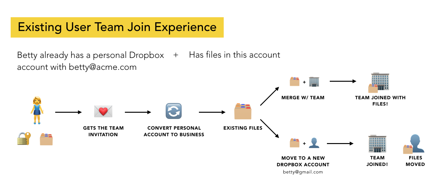
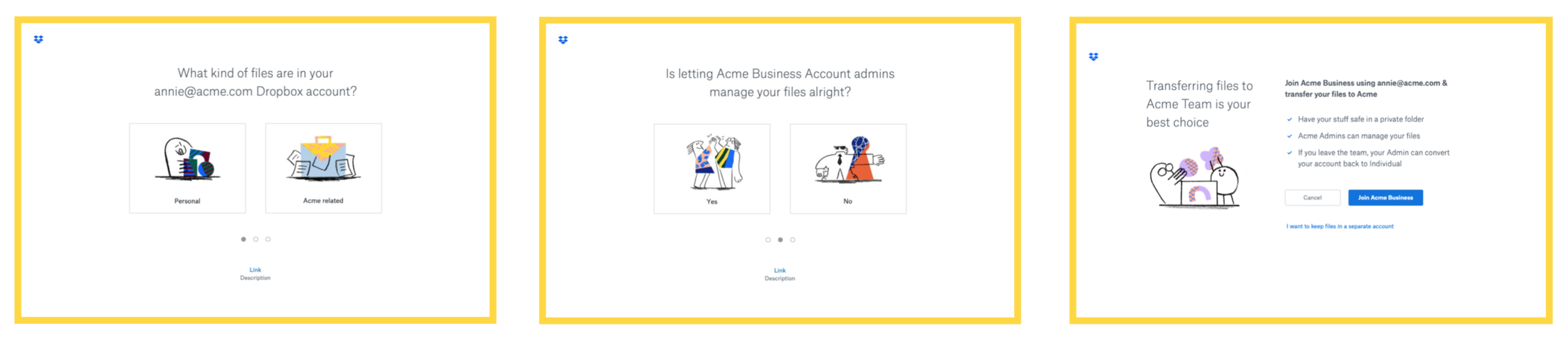
Existing User Join Experience Flow
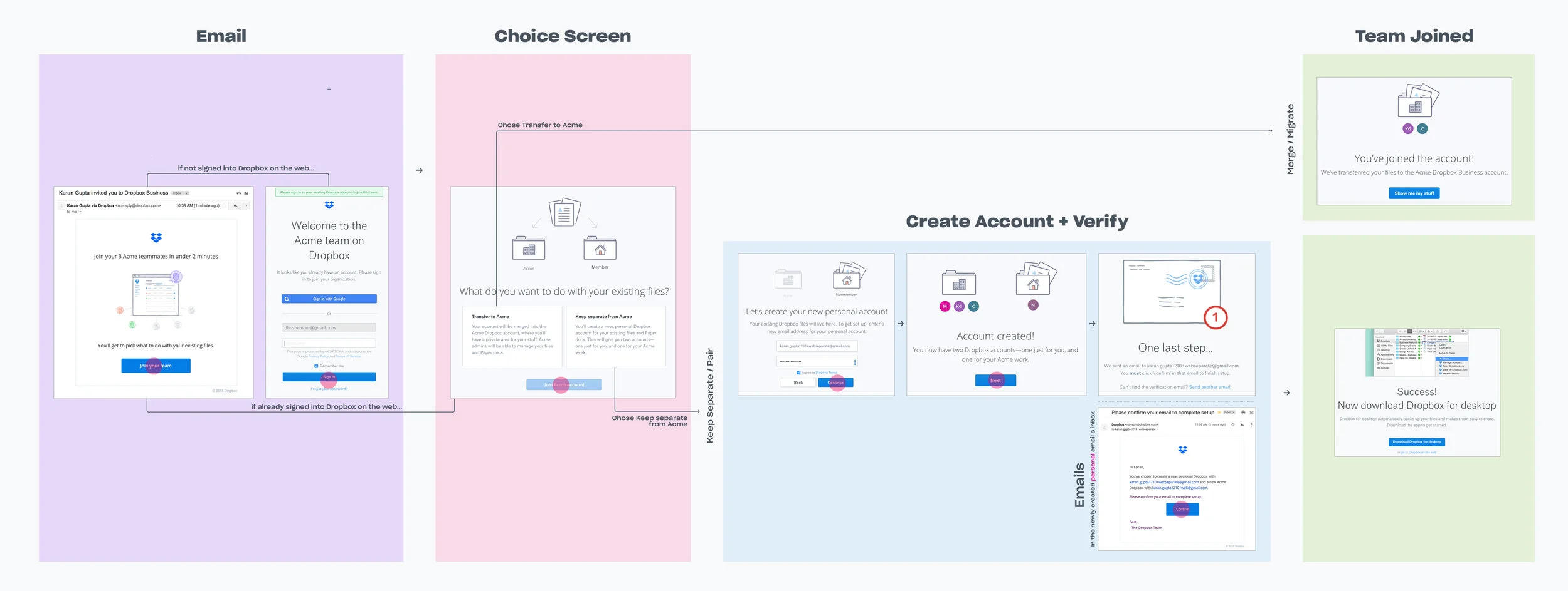
Users get an e-mail from the admin to join the team.
If they are not logged into Dropbox, they are asked to login.
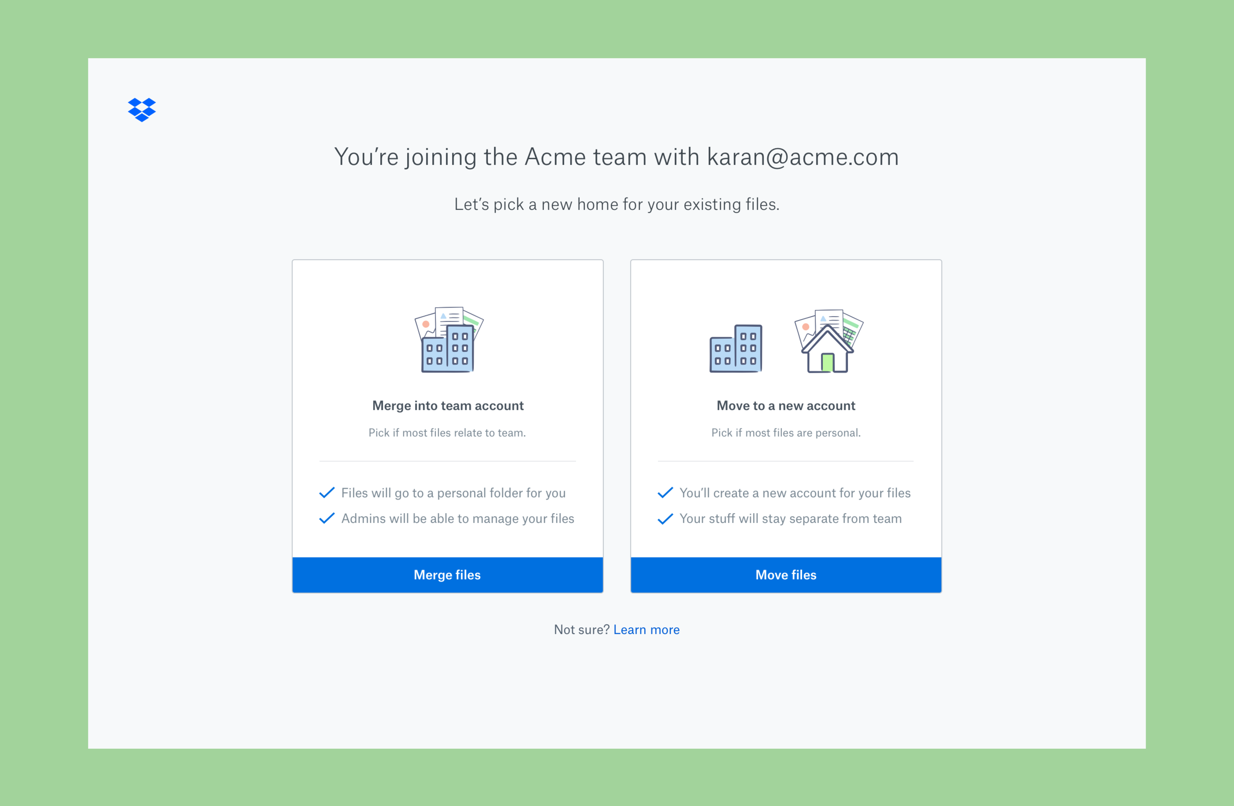
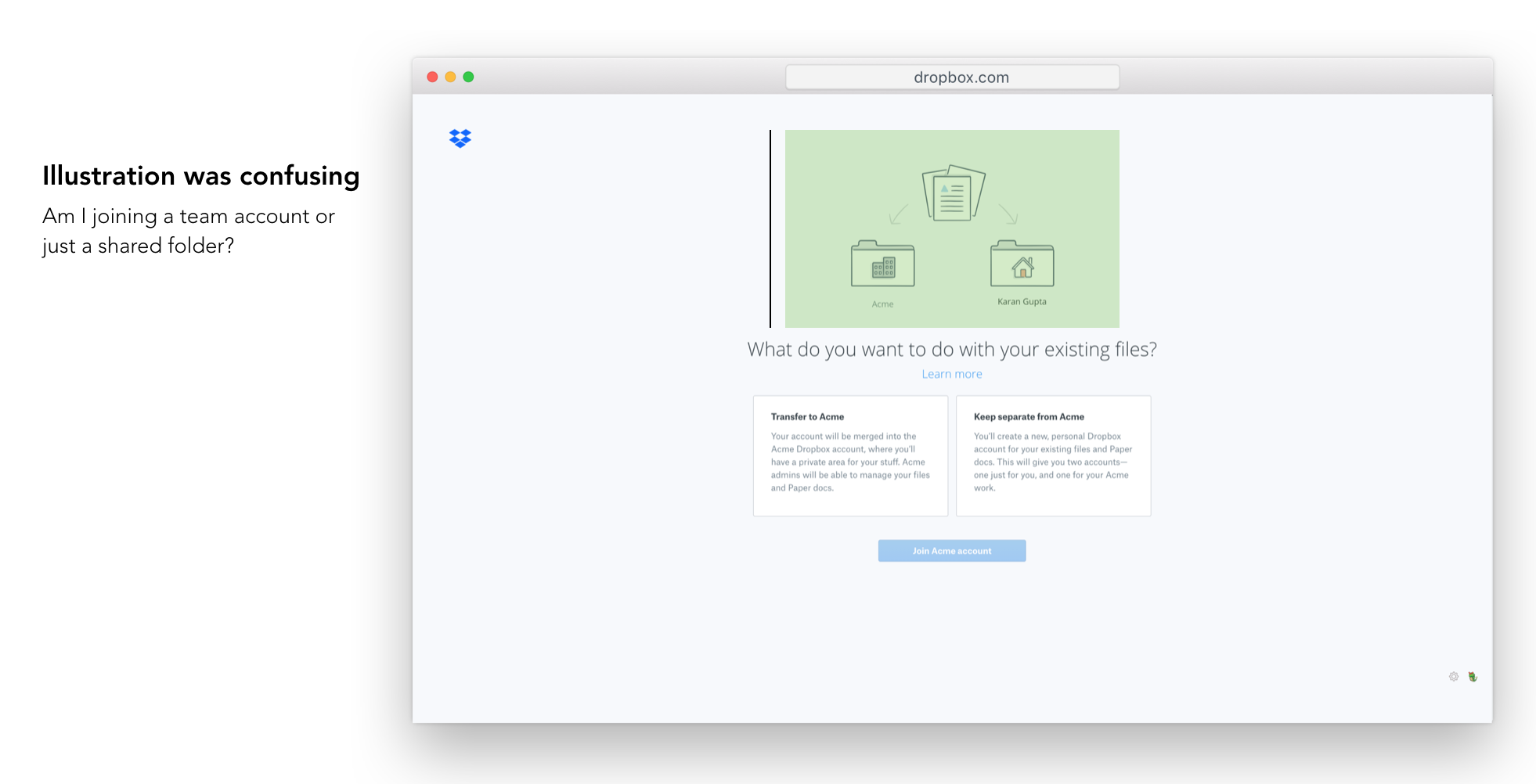
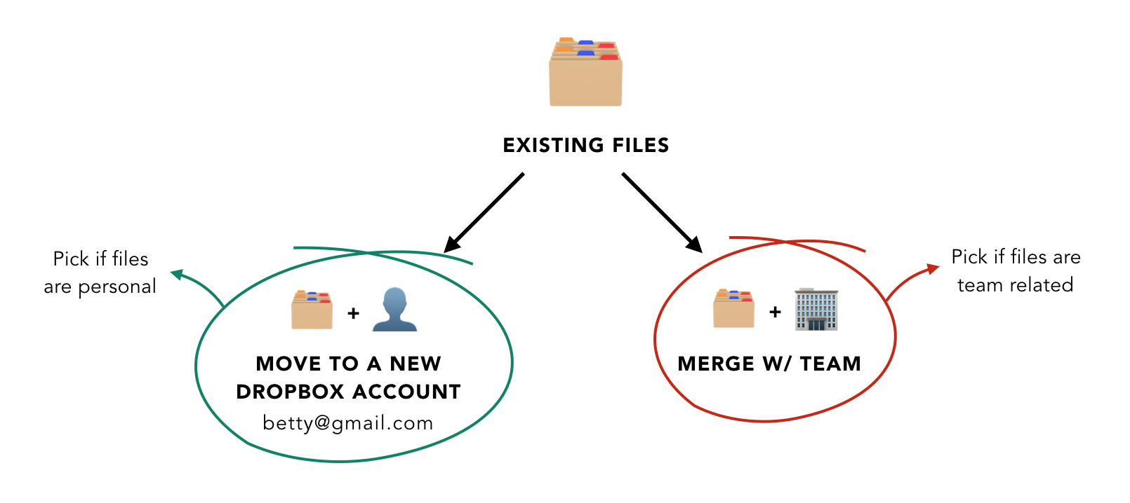
After logging in, the user is taken to the choice screen to pick between transferring files to the team account or keeping them separate.
If the user picks transfer to team — their files are merged into the team account; if the user picks keep separate — they are taken through steps to create a new account.
Why were existing users not joining?
Funnel Analysis
I worked with the Analyst to get the drop-off numbers from the e-mail to successfully joining.
10% drop-off happened from the e-mail to the choice screen
25% drop-off happened at the choice screen
Support Ticket Analysis
I worked with our Customer Support partner to find out that we were getting 250 support tickets/mo related to joining.
Interestingly, the tickets were not about “I don’t know what choice to make”, but about requesting to undo merging their files.
I. Some users were not intending to join the team
Confused team invite e-mail w/ a shared folder e-mail
Treated the choice screen as being about a folder
II. Some users were intending to join, but didn’t want to merge
Some users were powering through the flow & didn’t read
Others thought the choice was b/w create account or don’t
Usability Testing
We showed the current flow to 6 users to get more color into what was causing the confusion on the choice screen.
How might we…
increase comprehension on the choice screen, so that users understand the difference b/w the two & make the right decision?
One red flag I raised at this point with my PM was that increasing comprehension may lead to fewer joins as it may prevent the unintended mergers to abandon. But it would be a better user experience, which we can measure using a drop in CX tickets.
Concept Ideas
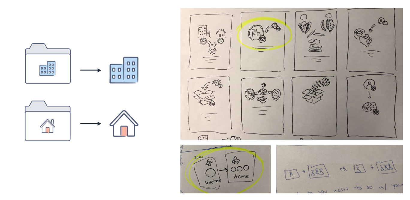
Hypothesis I: Show Files on the choice screen
If we show the ‘existing files’ the user has in their Dropbox, they would better understand if they want to merge those files or keep them separate.
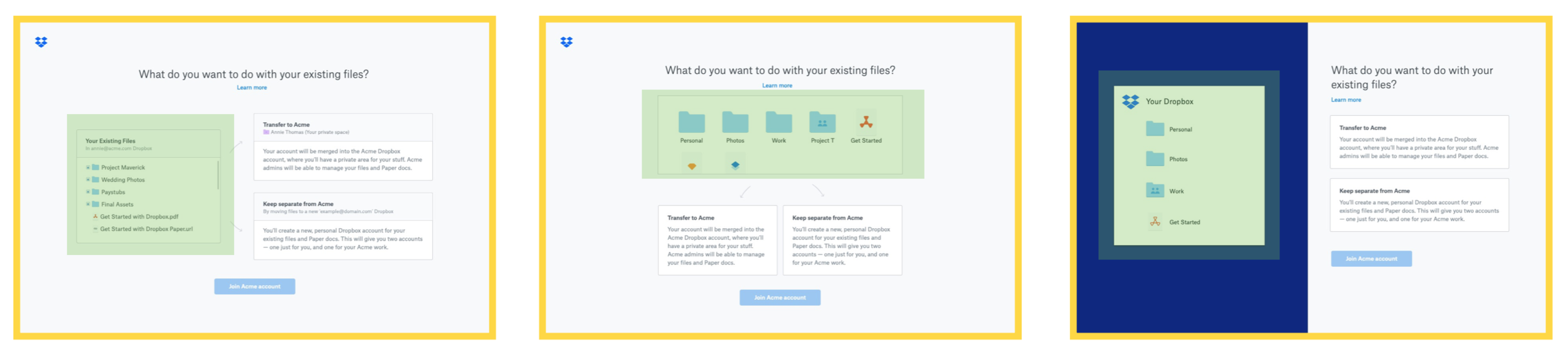
❌Showing tree structure was engineering expensive
❌May allude to that some files can be selected and moved
Hypothesis II: Add helper questionnaire on the choice screen
If we ask users a series of questions about their files, we can make the choice for them.
✅Takes away the decision making cognitive load off of users
❌Feels like a band-aid experience: Doesn’t help in making the choices clearer, but adds an experience on top
Hypothesis III: Help text in context + Visual clean-up
If we tell in what situation should the user pick which choice, make the illustration about accounts, fix the visual hierarchy of the text on the page, users would be able to make the right choice.
✅Incremental change: Meets the goal of the least eng effort
✅Makes it easier for users to make the decision
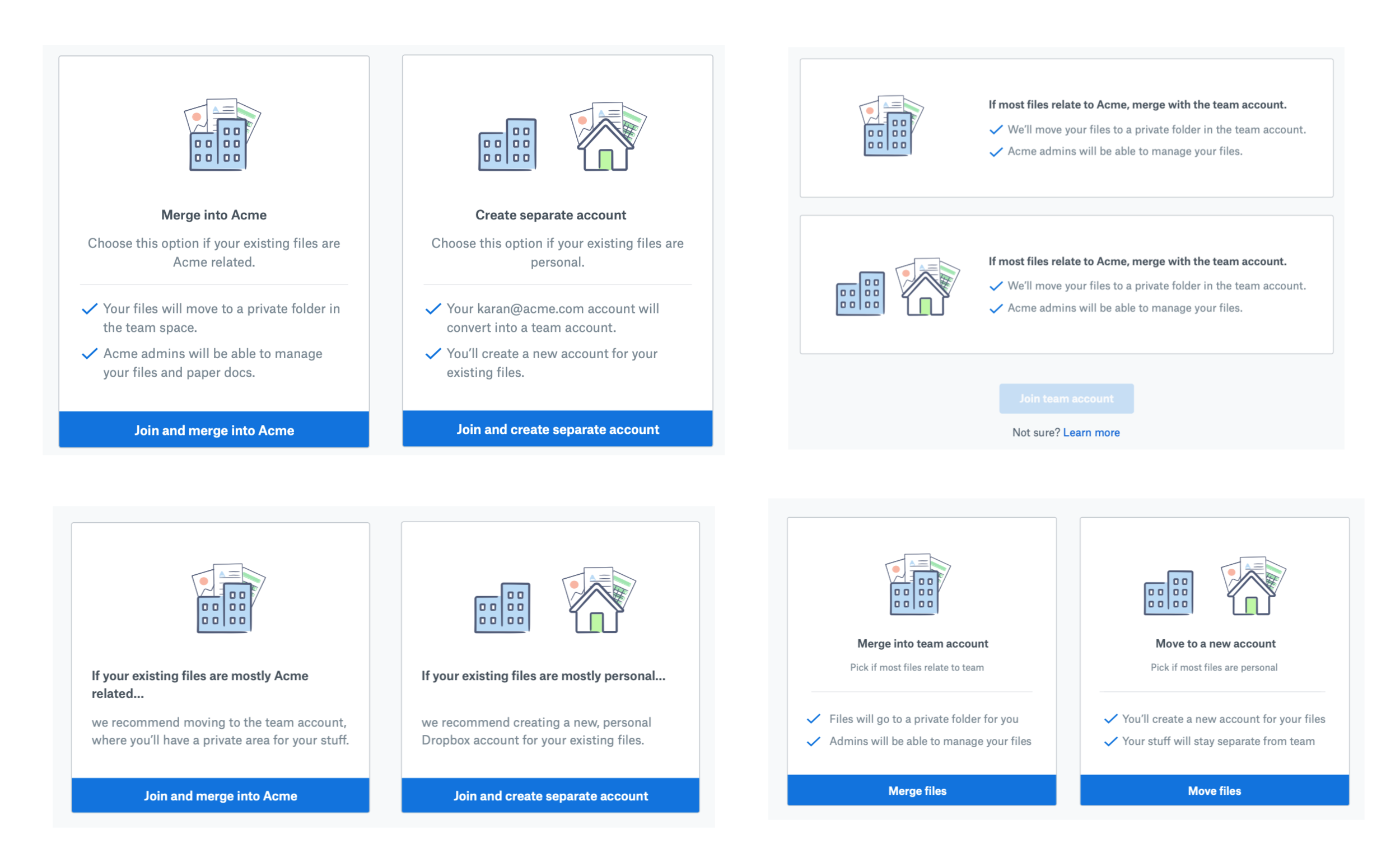
Choice Screen Design Explorations
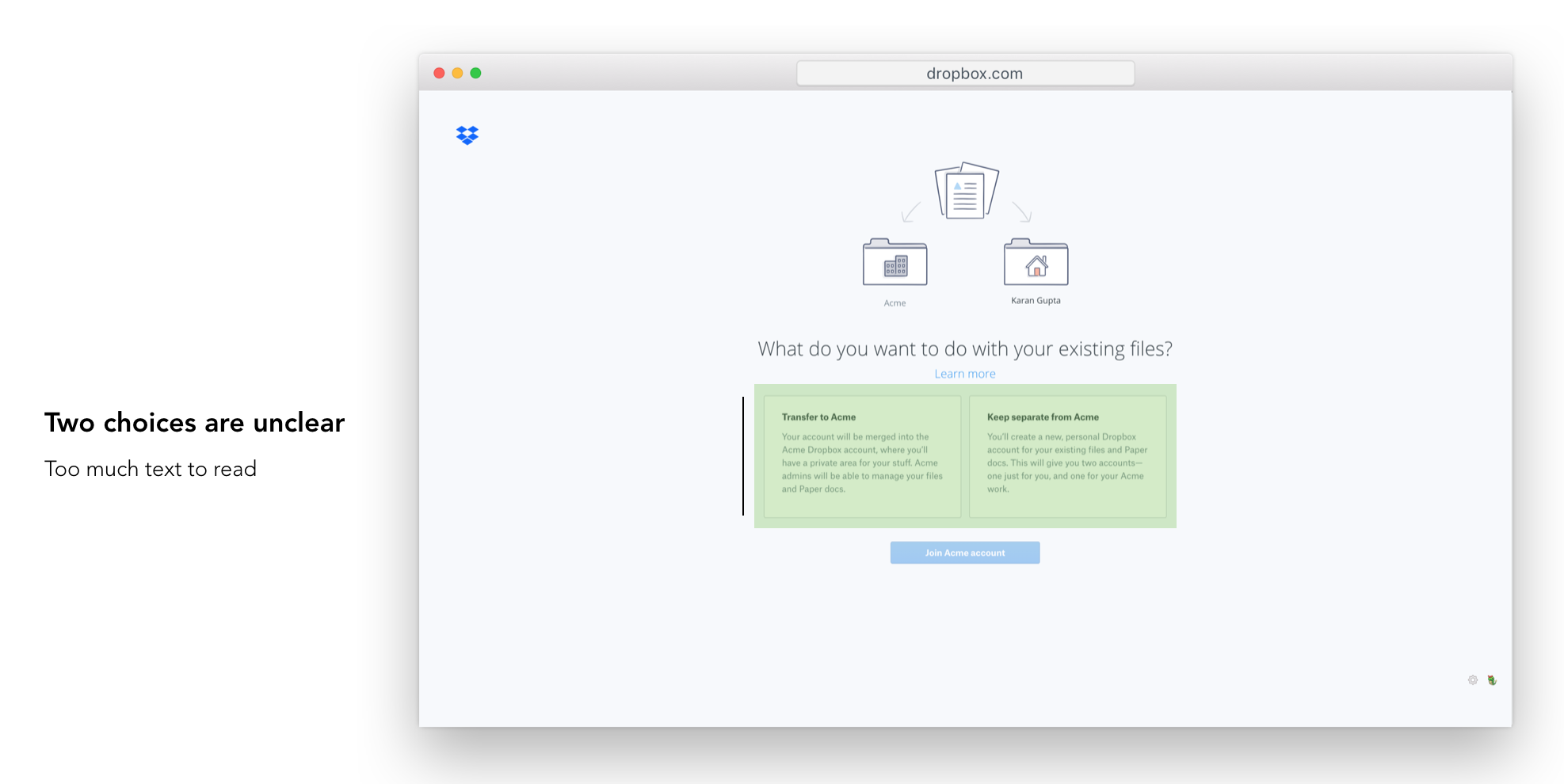
Illustration Simplification
I tried different ways to express the concept of merge into team v/s keep it separate, but after showing some of them to folks around the office it was in fact getting more complex.
Looking back at main reason why users were getting confused with the illustration was the folder chrome around work/home illustrations. I decided to remove that for the easiest fix.
Help Text Placement + Hierarchy
I explored different ways where we could place the help text which tells the user which choice to pick when. (Transfer if files are team related, Keep separate if files are personal).
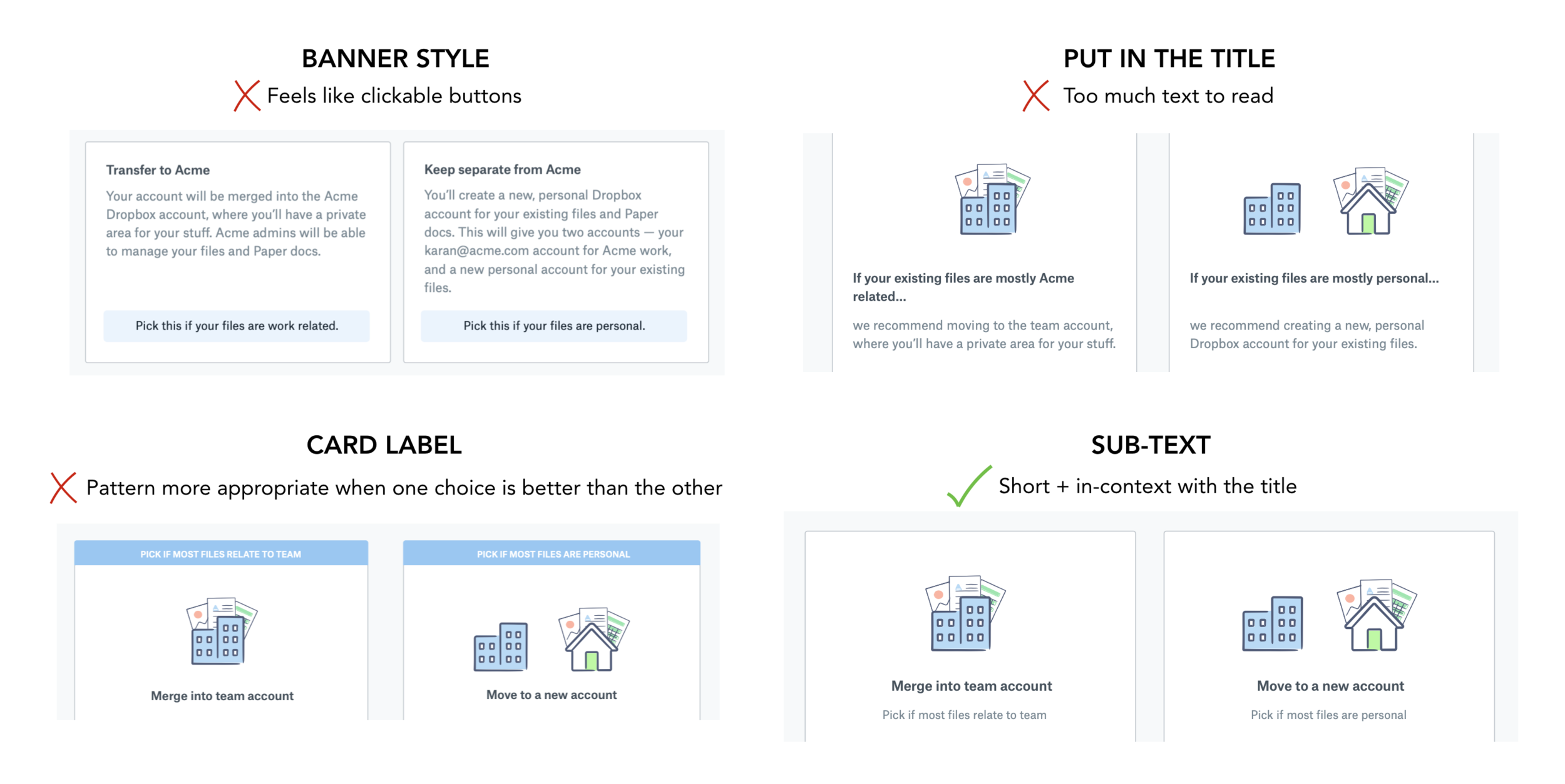
I took these variations to the design session to get feedback and decided to go with the sub-text approach for the reasons mentioned above.
Layout + Copy + CTA Iterations
I did a similar exercise working with the copywriter to figure out the best layout for the cards and the copy within it to increase comprehension.
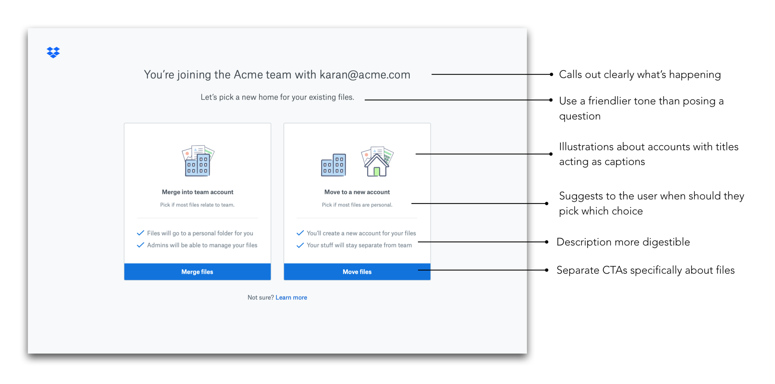
Final Design
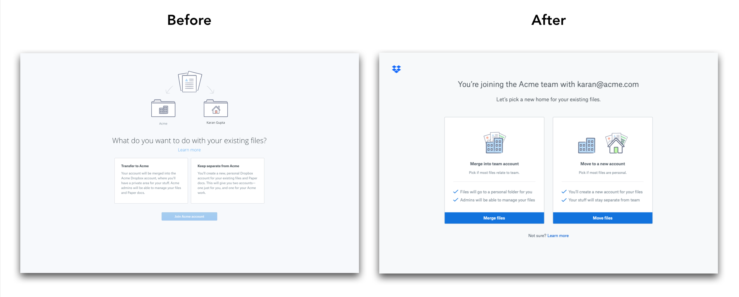
Key Design Decisions
User Testing
We took this back to Real World Wednesdays and showed the new designs to 6 different users. 5/6 participants understood the choices!
Experiment Results
Joins went up by 1.6% (not stat sig)
More people merged in the variant than the control
# of support tickets went down by 52%! 🎉
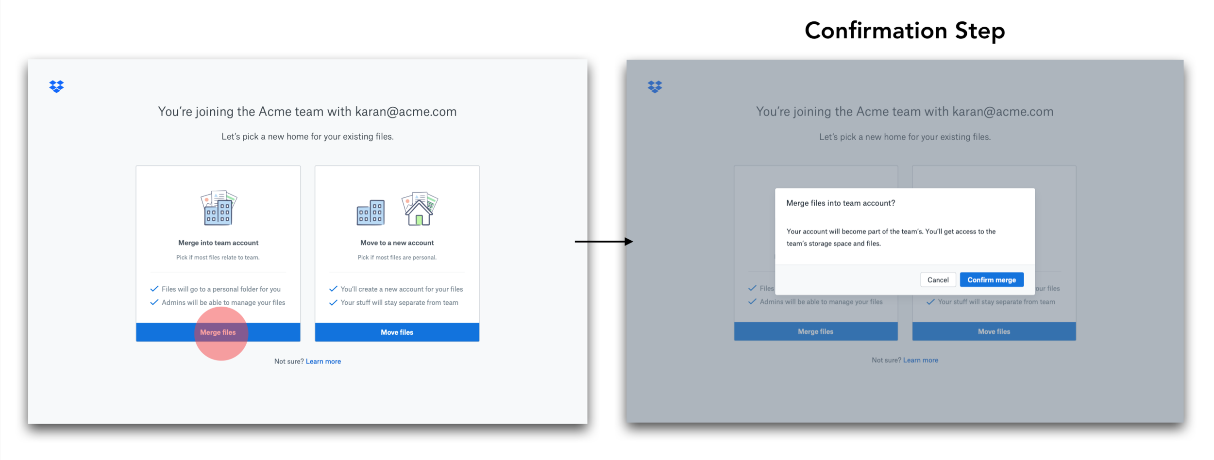
Folks still writing in wanted a way to move files to an existing Dropbox account instead of creating a new account
Verdict — Launch the experience!
Reflection
What worked well
Were able to identify the core problem of comprehension
Great copy-design collaboration let to a solid final outcome
What could’ve been better
Realizing sooner that increasing joins isn’t the right metric
Use motion design to explain the two choices